Skip to article frontmatterSkip to article content

Example 4: Abundance Analysis

Import Libraries and Install Dependencies

import os
import pandas as pd
import numpy as np
import matplotlib.pyplot as plt
import seaborn as sns
import statsmodels.api as sm

Load the data

Fert = pd.read_csv("Combinedsp24_2_Fert_gottcha2.full.tsv", sep="\t")
FertSp = Fert[Fert['LEVEL'] == "species"]

NoFert = pd.read_csv("Combinedsp24_2_NoFert_gottcha2.full.tsv", sep="\t")
NoFertSp = NoFert[NoFert['LEVEL'] == "species"]

Regression analysis

# Selecting columns
Fertspm = FertSp.iloc[:, [1, 9, 15, 16]]  # Adjust for zero-based index
NoFertspm = NoFertSp.iloc[:, [1, 9, 15, 16]]

# Merging data
Combined = pd.merge(Fertspm, NoFertspm, on="NAME", how="outer").fillna(0)

# Remove specific species
Combined = Combined[Combined['NAME'] != "Streptomyces griseofuscus"]

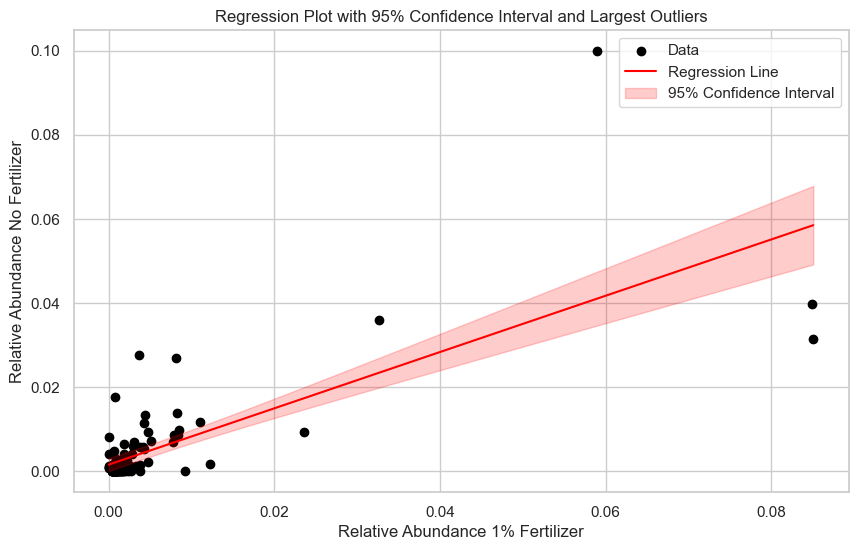
# Linear regression model
X = Combined['REL_ABUNDANCE_x']
y = Combined['REL_ABUNDANCE_y']
X_const = sm.add_constant(X)  # Add constant for intercept
model = sm.OLS(y, X_const).fit()

# Predict values and confidence intervals
x_values = np.linspace(X.min(), X.max(), 100)
x_values_const = sm.add_constant(x_values)
y_pred = model.predict(x_values_const)
predictions = model.get_prediction(x_values_const)
confidence_interval = predictions.conf_int(alpha=0.05)
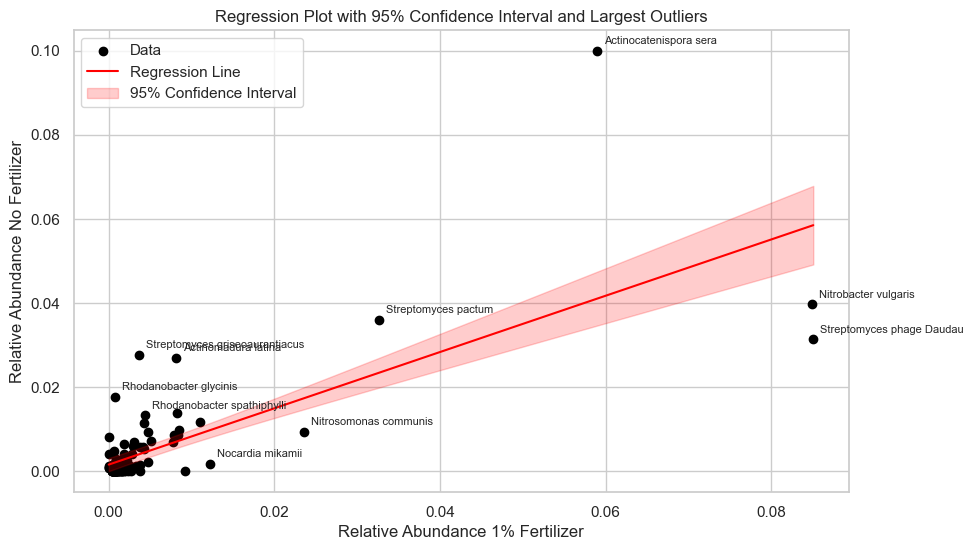
# Calculate residuals
Combined['residual'] = y - model.predict(X_const)
Combined['abs_residual'] = Combined['residual'].abs()

# Get the 10 largest outliers
largest_outliers = Combined.nlargest(10, 'abs_residual')

# Plot
sns.set(style="whitegrid")
fig, ax = plt.subplots(figsize=(10, 6))

# Scatter plot
ax.scatter(X, y, c='black', label="Data")

# Regression line
ax.plot(x_values, y_pred, color='red', label="Regression Line")

# Confidence interval
ax.fill_between(
    x_values,
    confidence_interval[:, 0],  # Lower bound
    confidence_interval[:, 1],  # Upper bound
    color='red',
    alpha=0.2,
    label="95% Confidence Interval"
)
# Customize plot
ax.set_xlabel("Relative Abundance 1% Fertilizer")
ax.set_ylabel("Relative Abundance No Fertilizer")
ax.set_title("Regression Plot with 95% Confidence Interval and Largest Outliers")
ax.legend()

plt.show()
<Figure size 1000x600 with 1 Axes>
# Improve plot by labeling the 10 greatest outliers
sns.set(style="whitegrid")
fig, ax = plt.subplots(figsize=(10, 6))

# Scatter plot
ax.scatter(X, y, c='black', label="Data")

# Regression line
ax.plot(x_values, y_pred, color='red', label="Regression Line")

# Confidence interval
ax.fill_between(
    x_values,
    confidence_interval[:, 0],  # Lower bound
    confidence_interval[:, 1],  # Upper bound
    color='red',
    alpha=0.2,
    label="95% Confidence Interval"
)

# Label largest outliers
for _, row in largest_outliers.iterrows():
    ax.annotate(
        row['NAME'],  # Label to display
        (row['REL_ABUNDANCE_x'], row['REL_ABUNDANCE_y']),  # Position of the point
        fontsize=8,
        xytext=(5, 5),
        textcoords="offset points",
    )

# Customize plot
ax.set_xlabel("Relative Abundance 1% Fertilizer")
ax.set_ylabel("Relative Abundance No Fertilizer")
ax.set_title("Regression Plot with 95% Confidence Interval and Largest Outliers")
ax.legend()

# Show plot
plt.show()
<Figure size 1000x600 with 1 Axes>