This notebook demonstrates how to use t-Distributed Stochastic Neighbor Embedding (t-SNE) to perform dimensionality reduction and visualize clustering relationships among organisms based on their phenotypic growth predictions. The process involves reducing high-dimensional data into a 2D space to identify clusters and relationships visually.
Step 1: Load Necessary Libraries
We import essential Python libraries:
- pandas: For data manipulation and loading tabular data.
- matplotlib: For plotting the clustering results.
- sklearn.manifold.TSNE: For dimensionality reduction using t-SNE.
import pandas as pd
import matplotlib.pyplot as plt
from sklearn.manifold import TSNE
Step 2: Load the Data
We load two phenotype prediction datasets:
- ENIGMA dataset (couresty of ENIGMA group, and Hira Lesea)
- PMI dataset (courtesy of PMI group, and Ranjan Priya)
The first column of each dataset is set as the index (organism names).
# Load the data
enigma_data = pd.read_csv('ENIGMA_phenoPredictions_CompleteM.tsv', sep='\t', index_col=0)
pmi_data = pd.read_csv('PMI_phenoPredictions_CompleteM.tsv', sep='\t', index_col=0)
Step 3: Label and Combine the Datasets
Each dataset is labeled to indicate its source (ENIGMA or PMI), and then the two datasets are combined into a single DataFrame to facilitate unified analysis.
# Label the datasets
enigma_data['Dataset'] = 'ENIGMA'
pmi_data['Dataset'] = 'PMI'
# Combine the datasets
combined_data = pd.concat([enigma_data, pmi_data])Step 4: Prepare Data for t-SNE
We separate the dataset labels (used for coloring in the visualization) and the binary growth prediction data. The latter is used as the feature matrix for dimensionality reduction.
# Separate the 'Dataset' column for coloring and drop it from the feature matrix
labels = combined_data['Dataset']
feature_matrix = combined_data.drop(columns=['Dataset'])
Step 5: Perform t-SNE Dimensionality Reduction
We use t-SNE to reduce the high-dimensional feature matrix to 2D. This reduction:
- Helps identify clusters of similar organisms.
- Preserves local and global structure in the data.
- Creates a visually interpretable 2D representation.
# Perform t-SNE to reduce dimensions to 2D
tsne = TSNE(n_components=2, random_state=42, perplexity=30, n_iter=300)
#tsne = TSNE(n_components=2, perplexity=30, n_iter=300)
tsne_results = tsne.fit_transform(feature_matrix)
/srv/conda/envs/notebook/lib/python3.11/site-packages/sklearn/manifold/_t_sne.py:1164: FutureWarning: 'n_iter' was renamed to 'max_iter' in version 1.5 and will be removed in 1.7.
warnings.warn(
t-SNE Initialization: TSNE(n_components=2, random_state=42, perplexity=30, n_iter=300)
The TSNE object is initialized with the following parameters:
n_components=2:- Specifies the number of dimensions in the output space.
- The high-dimensional input data will be reduced to 2 dimensions, typically for visualization purposes.
random_state=42:- Ensures reproducibility by setting a fixed seed for randomness.
- Without this parameter, the results may vary slightly between runs due to the stochastic nature of t-SNE.
- The value
42is commonly used in data science as a default seed, but any fixed integer can be used.
perplexity=30:- Controls the balance between local and global data structure.
- Determines the number of effective neighbors each data point considers.
- Typical values range between 5 and 50, depending on the dataset size (smaller perplexity for smaller datasets).
n_iter=300:- Specifies the number of optimization iterations to refine the t-SNE representation.
- Higher values may produce better results at the cost of longer computation time.
Fit and Transform: tsne.fit_transform(feature_matrix)
This step applies t-SNE to the input data (feature_matrix) and transforms it into the lower-dimensional space:
feature_matrix:- Represents the high-dimensional data to be reduced.
- Each row corresponds to an individual data point (e.g., an organism).
- Each column corresponds to a feature (e.g., growth prediction for a specific carbon source).
fit_transform():- Fits the t-SNE model to the
feature_matrix. - Transforms the high-dimensional input data into a 2D space.
- Fits the t-SNE model to the
Output:
- The result (
tsne_results) is a NumPy array of shape(n_samples, 2), where:n_samples: Number of rows in the input data.2: Number of reduced dimensions (as specified byn_components).
- Each row in the result represents a data point in the 2D t-SNE space, preserving the structure and relationships of the original high-dimensional data.
- The result (
Example Output
If the input feature_matrix contains growth predictions for 100 organisms across 50 features (carbon sources):
- Input: A matrix of shape
(100, 50)(100 rows, 50 columns). - Output: A 2D matrix of shape
(100, 2), where each organism is represented by a point in the 2D space.
Step 6: Visualize the t-SNE Results
We plot the t-SNE results as a scatter plot. Points (organisms) are color-coded based on their dataset of origin (ENIGMA or PMI), making it easier to distinguish between groups and identify clusters.
# Convert results to a DataFrame for easy plotting
tsne_df = pd.DataFrame(tsne_results, columns=['t-SNE 1', 't-SNE 2'])
tsne_df['Dataset'] = labels.values
Visualize the t-SNE Clusters
- Scatter Plot: Organisms are visualized as points in the 2D t-SNE space.
- Color Coding: Points are colored by dataset type:
- Blue for ENIGMA.
- Green for PMI.
- Labels:
- t-SNE 1 and t-SNE 2 represent the reduced dimensions.
- The legend distinguishes between the datasets.
# Plotting the t-SNE results with color coding for each dataset
plt.figure(figsize=(10, 8))
colors = {'ENIGMA': 'blue', 'PMI': 'green'}

for dataset in colors:
    subset = tsne_df[tsne_df['Dataset'] == dataset]
    plt.scatter(subset['t-SNE 1'], subset['t-SNE 2'], s=50, alpha=0.7, label=dataset, color=colors[dataset])

plt.title("t-SNE Plot of Organisms Based on Growth Predictions Across Carbon Sources")
plt.xlabel("t-SNE 1")
plt.ylabel("t-SNE 2")
plt.legend(title='Dataset')
plt.show()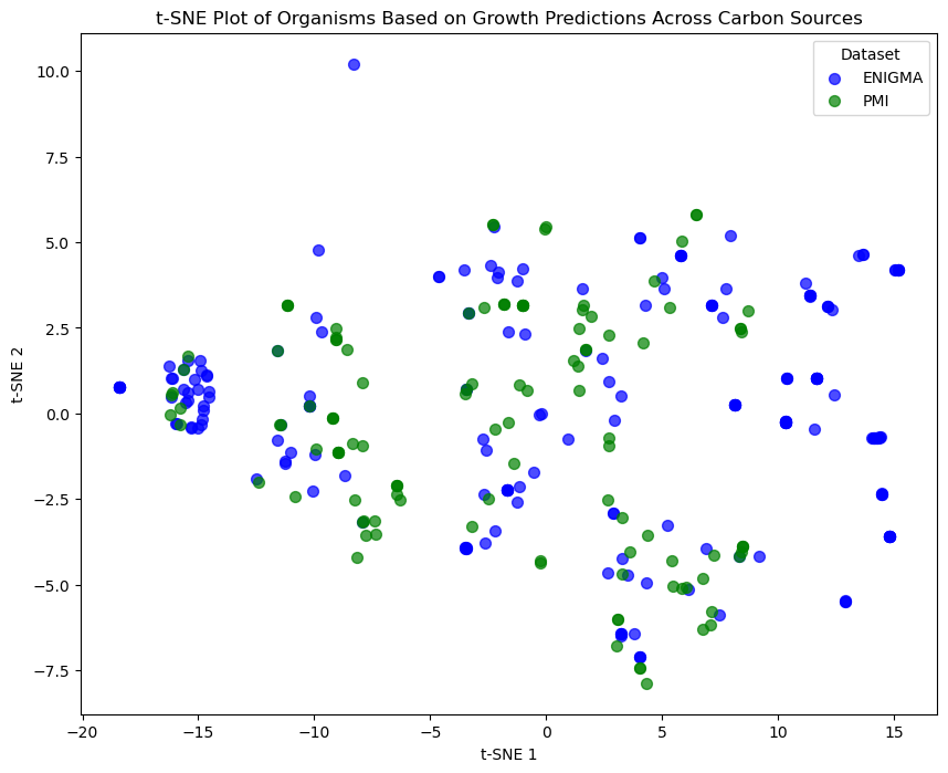
Explanation of the Code
1. What is Happening?
This code iterates over dataset types (e.g., ENIGMA and PMI) to plot points in a 2D t-SNE space. The steps include:
- Filtering the data for each dataset type.
- Plotting the points with specific colors and labels for differentiation.
2. Explanation of Each Line
for dataset in colors:
- What It Does: Iterates over the
colorsdictionary where:- Keys represent dataset types (e.g.,
'ENIGMA','PMI'). - Values represent colors assigned to those datasets (e.g.,
'blue','green').
- Keys represent dataset types (e.g.,
subset = tsne_df[tsne_df['Dataset'] == dataset]
- What It Does:
- Filters the
tsne_dfDataFrame to select only rows belonging to the current dataset.
- Filters the
- Why It’s Needed:
- Ensures points from each dataset are plotted separately with their own color.
plt.scatter(subset['t-SNE 1'], subset['t-SNE 2'], s=50, alpha=0.7, label=dataset, color=colors[dataset])
What It Does:
- Plots a scatter plot of points for the current dataset in the 2D t-SNE space.
Parameters:
subset['t-SNE 1'],subset['t-SNE 2']: The x and y coordinates in the reduced 2D space.s=50: Sets the point size to50.alpha=0.7: Adds transparency to the points for better visualization of overlaps.label=dataset: Adds a legend label for the dataset.color=colors[dataset]: Assigns the predefined color to the dataset.
3. What Does It Accomplish?
This loop creates a scatter plot where:
- Points for each dataset (e.g., ENIGMA and PMI) are plotted in 2D t-SNE space.
- Each dataset is visually distinguished using:
- Color (e.g., blue for ENIGMA, green for PMI).
- Legend labels indicating the dataset type.
- Transparency (
alpha=0.7) makes overlapping points easier to interpret.
About t-SNE Plot
Purpose: The t-SNE plot provides an intuitive way to visualize high-dimensional relationships.
- Organisms with similar growth patterns (e.g., similar ability to utilize carbon sources) cluster together in the 2D space.
Interpretation:
- Clusters: Indicate groups of organisms with similar phenotypic profiles.
- Outliers: Represent unique organisms with distinct growth patterns.
Applications: This technique is widely used in biology for:
- Clustering phenotypic or genetic data.
- Exploratory data analysis in other fields.